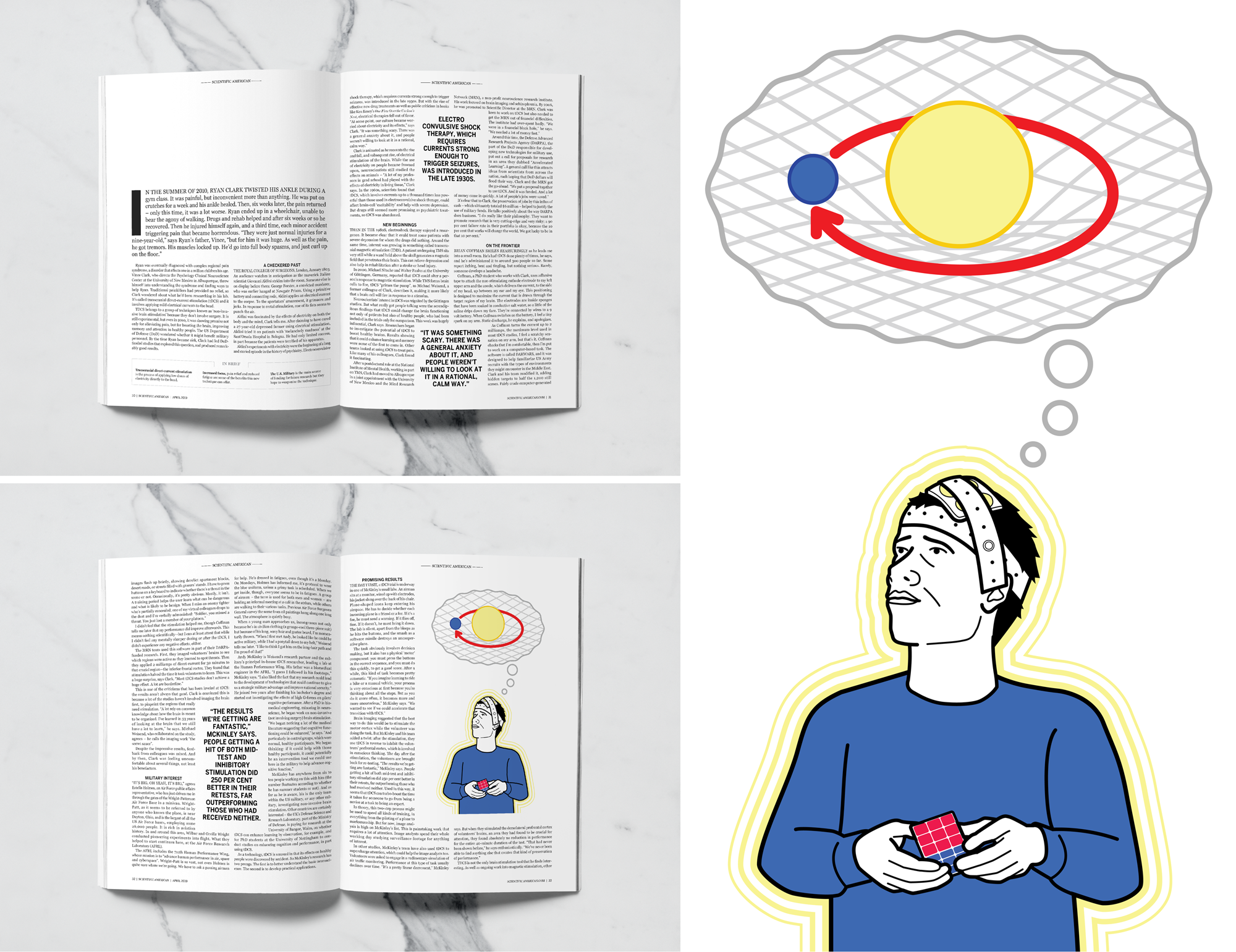
This editorial layout was created for a school assignment. We were provided with an unformatted article and were tasked with laying it out in the publication of our choice. I chose Scientific American because it suited the subject matter, and because of it's clean, classic layout.
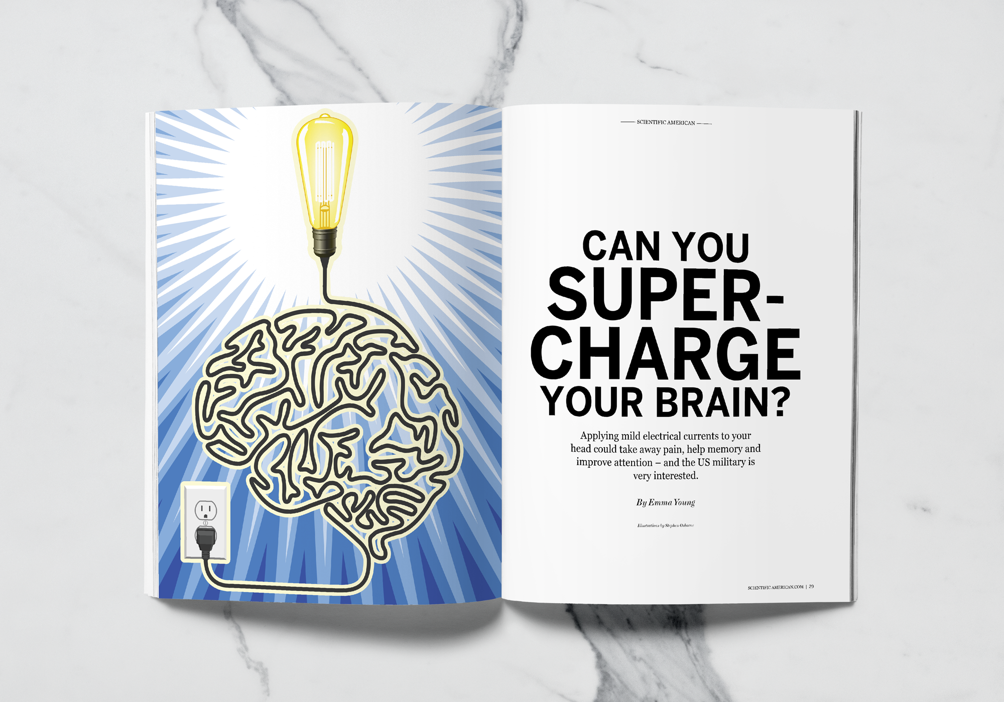
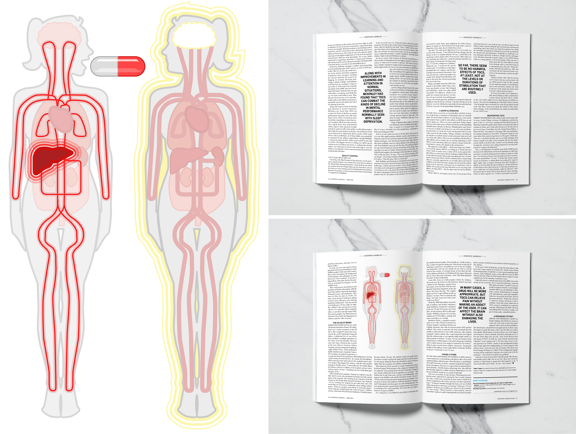
I created the illustrations to reflect the content of the article, sticking to a restrained palette to compliment the clean design.
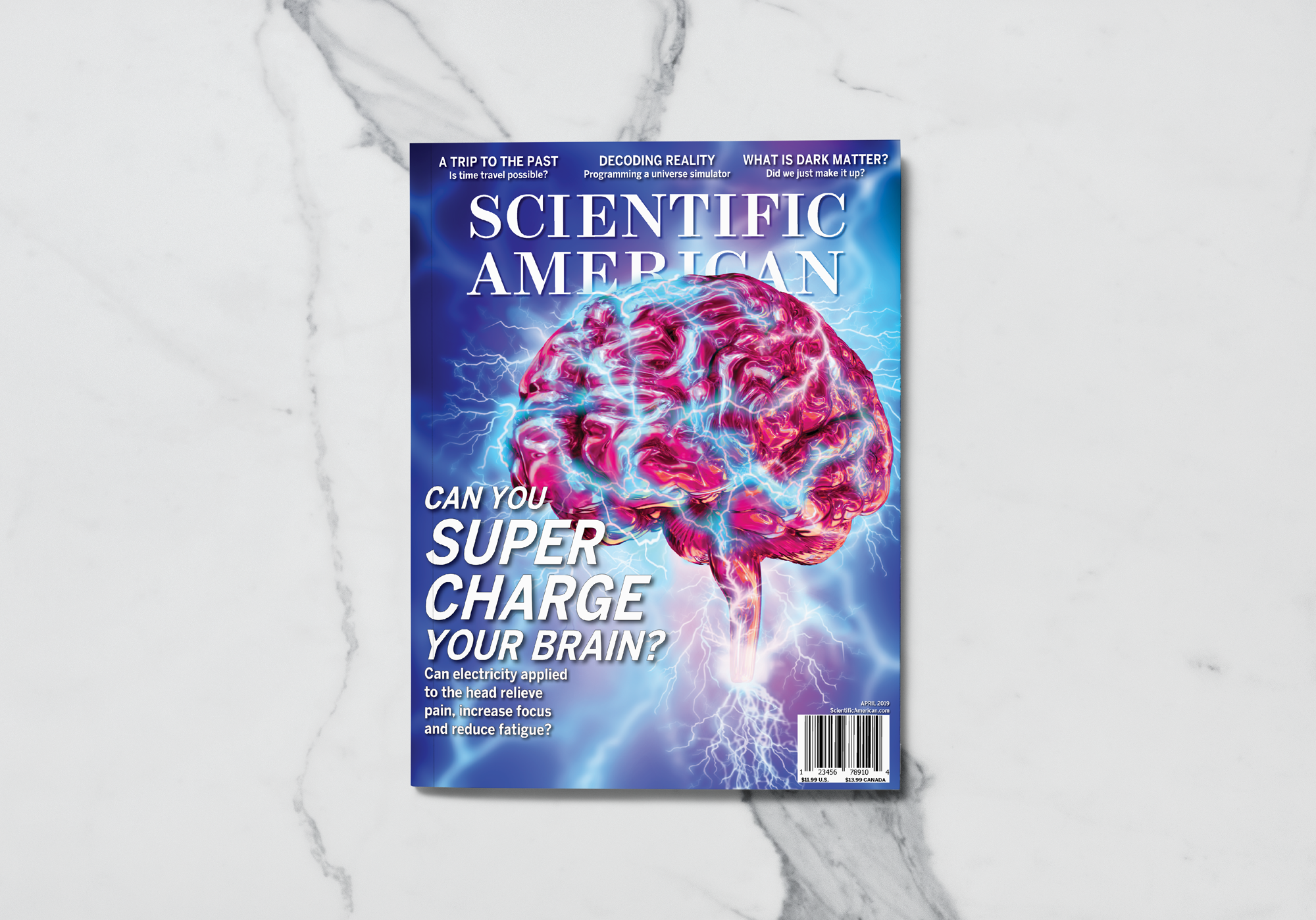
The cover was created as a photo composite. This image is much more flashy as to grab a passerby's attention, typical of a Scientific American cover.
Photo Composite
Illustration
Layout


